
Graphic violence
The 2016 version of Curios and Conundrums came in a deliciously large format, and I mean large — an old-fashioned broadsheet newspaper, running 14 by 23 inches per page (resulting in more than a two-foot-wide centre spread). That’s a lot of real estate to fill. Eye-catching features were essential. Most issues contained at least one feature told wholly or in part through infographics.
Any good infographic is trickier than it looks. It is not just an adjunct to a story; it is a story in itself. As such, it requires all the elements of a story, like narrative structure and point of view. And the form should add something to the telling. A timeline, for example, is a common and basic form of infographic. You see them everywhere. But without a compelling point of view — a strong rationale, whether visual, design or content-driven, for what information is included — a timeline is just a list. Why bother?
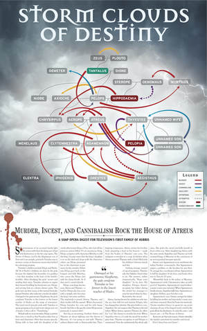
One of my favourite infographics was devised by the excellent designer Kris Forge for the “From Death and Dark Oblivion” issue of Curios and Conundrums, an issue exploring the concept of hubris. To my mind, as editor, that meant at least one story had to delve deep into ancient Greek theatre where so many famous tragedies examine humankind's arrogance, folly and self-destruction. But an academic parsing of the Greek notions of hamartia, hybris, ate, and nemesis might not be the most accessible of stories. But you never know. Research leads the way.
I decided to focus on the Oresteia, Aeschylus’ trilogy exploring the multigenerational curse inherited by Orestes, son of Agamemnon, hero of the Trojan War. It doesn’t end well.
From the start, I knew I wanted something of a genealogical chart to illustrate the story. That’s easier said than done. There are countless competing and contradictory myths and dramatic traditions. Identifying a clear through line was a tricky business.
While showing who begat whom was important, how they did the begetting — and undid the begetting --- was much more germane. After many false starts and blind alleys, I think the infographic we settled on powerfully communicates the web of violence and weirdness ensnaring six generations of one family. And that graphic crystallization of melodramatic depravity, in turn, changed how I wrote the final piece. The story ended up a bloody-tongue-in-cheek entry to Soap Opera Digest. (Hat tip to my colleague, Jennifer Orme, for suggesting I commit the piece fully to that idea.)
I hope you enjoy your visit with The House of Atreus.
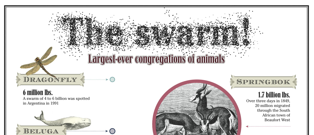
Our paranoia issue from 2016 had all sorts of creepy crawlies throughout, just to get our readers itchy with runaway thoughts. It featured a gorgeous full-page infographic titled "The Swarm.” I sourced most of the imagery and did reams of research. The math at times was devilishly difficult, but understanding what the story communicates shouldn’t be.
The 2016 version of Curios and Conundrums came in a deliciously large format, and I mean large — an old-fashioned broadsheet newspaper, running 14 by 23 inches per page (resulting in more than a two-foot-wide centre spread). That’s a lot of real estate to fill. Eye-catching features were essential. Most issues contained at least one feature told wholly or in part through infographics.
Any good infographic is trickier than it looks. It is not just an adjunct to a story; it is a story in itself. As such, it requires all the elements of a story, like narrative structure and point of view. And the form should add something to the telling. A timeline, for example, is a common and basic form of infographic. You see them everywhere. But without a compelling point of view — a strong rationale, whether visual, design or content-driven, for what information is included — a timeline is just a list. Why bother?
One of my favourite infographics was devised by the excellent designer Kris Forge for the “From Death and Dark Oblivion” issue of Curios and Conundrums, an issue exploring the concept of hubris. To my mind, as editor, that meant at least one story had to delve deep into ancient Greek theatre where so many famous tragedies examine humankind's arrogance, folly and self-destruction. But an academic parsing of the Greek notions of hamartia, hybris, ate, and nemesis might not be the most accessible of stories. But you never know. Research leads the way.
I decided to focus on the Oresteia, Aeschylus’ trilogy exploring the multigenerational curse inherited by Orestes, son of Agamemnon, hero of the Trojan War. It doesn’t end well.
From the start, I knew I wanted something of a genealogical chart to illustrate the story. That’s easier said than done. There are countless competing and contradictory myths and dramatic traditions. Identifying a clear through line was a tricky business.
While showing who begat whom was important, how they did the begetting — and undid the begetting --- was much more germane. After many false starts and blind alleys, I think the infographic we settled on powerfully communicates the web of violence and weirdness ensnaring six generations of one family. And that graphic crystallization of melodramatic depravity, in turn, changed how I wrote the final piece. The story ended up a bloody-tongue-in-cheek entry to Soap Opera Digest. (Hat tip to my colleague, Jennifer Orme, for suggesting I commit the piece fully to that idea.)
I hope you enjoy your visit with The House of Atreus.
Our paranoia issue from 2016 had all sorts of creepy crawlies throughout, just to get our readers itchy with runaway thoughts. It featured a gorgeous full-page infographic titled "The Swarm.” I sourced most of the imagery and did reams of research. The math at times was devilishly difficult, but understanding what the story communicates shouldn’t be.
 RSS Feed